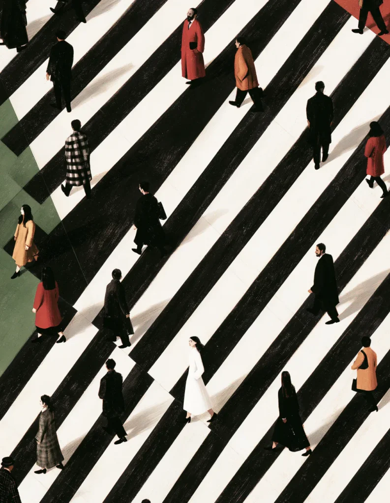
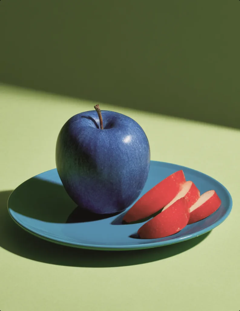
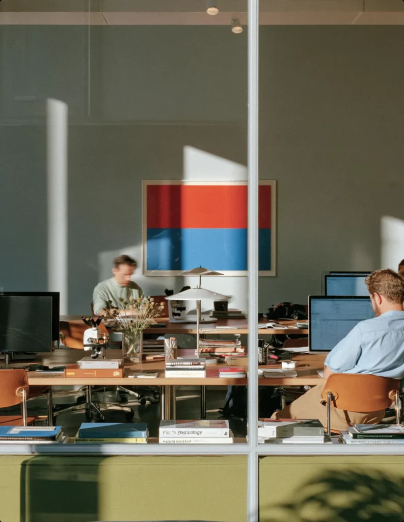
As digital design becomes more polished and precise, imperfection is returning through texture, spontaneity and small inconsistencies that make brands feel more human.
The Problem With Perfect
For years, digital design has moved towards greater precision. Grids became tighter, interfaces cleaner and brand systems increasingly systematic. The tools we use encourage alignment, consistency and repeatability — and for good reason.
But when everything is perfectly aligned, perfectly rendered and perfectly predictable, something can disappear.
The smallest irregularities often become the details we remember. A slightly uneven piece of type, a photograph with unexpected grain, an imperfect crop or an animation that feels physically unpredictable can make an experience feel less manufactured and more alive.
Imperfection Is Not Carelessness
There is an important difference between something that feels intentionally imperfect and something that simply feels unfinished.
Good imperfection still requires control.
A designer needs to understand the system before knowing where to break it. The irregularity works because it exists against a clear underlying structure. A rigid Swiss-inspired grid, for example, can become more expressive when one element deliberately escapes it. A highly controlled typographic system can feel more human when paired with photography that is raw, spontaneous or unpredictable. The contrast is what creates energy.
Perfection creates consistency. Imperfection creates character.
Three Ways Imperfection Can Add Character
- TextureGrain, material surfaces, printing artefacts and analogue imperfections can soften digital precision.
- Irregular compositionUnexpected crops, overlapping elements or asymmetric layouts can introduce tension without sacrificing hierarchy.
- Human movementPhotography and motion that capture gestures, mistakes and natural behaviour often communicate more emotion than perfectly staged imagery.

The Return of Texture
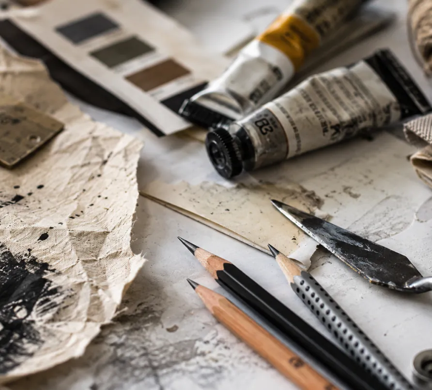
Flat, perfectly rendered surfaces dominated digital design for years. But we are increasingly seeing brands introduce physicality back into their visual systems.
Paper grain. Film noise. Scanned graphics. Handwritten marks. Rough typography. Distorted photography.
These elements do more than create a visual aesthetic. They remind us that someone — or something physical — exists behind the design.
When used with restraint, texture can create contrast against otherwise minimal layouts and make digital experiences feel more tactile.
NOTE
Imperfection works best when it has a role. Adding grain simply because it looks fashionable rarely creates meaningful character.
What Makes Imperfection Work?
Rather than adding randomness everywhere, it helps to define where the system is allowed to behave differently.
- Keep typography structured, but allow imagery to feel spontaneous.
- Maintain a consistent grid, but let selected elements break beyond it.
- Keep navigation predictable while allowing transitions to feel playful.
- Use a restrained palette and introduce texture as contrast.
- Let photography capture real moments instead of over-directing every frame.
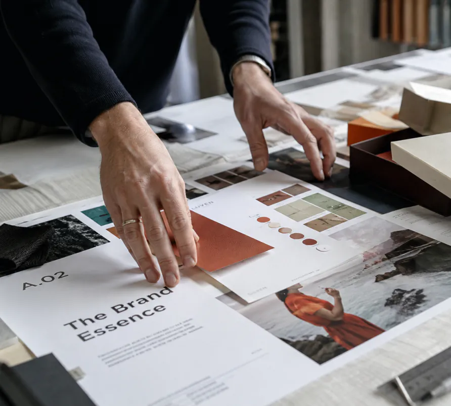
The more perfect our tools become, the more valuable signs of human presence may become.